Overview
The Gutenberg editor consists of several components. In this installment we will go through each one and explain their use.
Editor Components
The Toolbar

At the top of the editor, you will see the toolbar. This has buttons for various functions, including the block inserter, tools, undo/redo, document information, and the list view toggle.
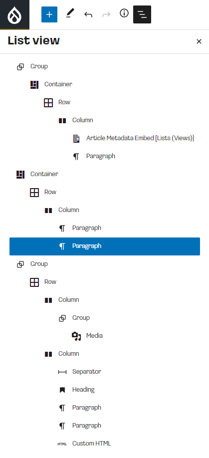
One thing to highlight on the toolbar is the list view; this is an extremely useful tool for viewing the overall structure of the Gutenberg document. You can use this to drill down into each component block of the document:
The editor
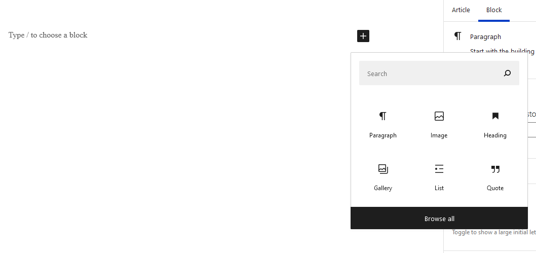
In the middle you will see the main content entry area. This is where you will enter content. You can start typing to create a paragraph block, or you can click the plus (+) icon to open the inline block browser. From here you can search for different block elements to insert:
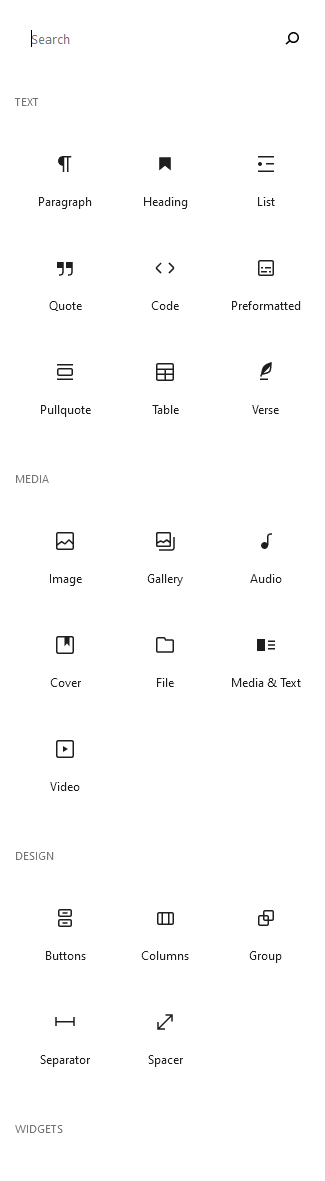
You can click the "Browse all" button to open the full list of available blocks.
Block settings
You can adjust the settings for a block in 2 places, the first of which is the inline block settings. When you focus on a block element, there will be a popup window with contextual settings, usually related to alignment and text style.

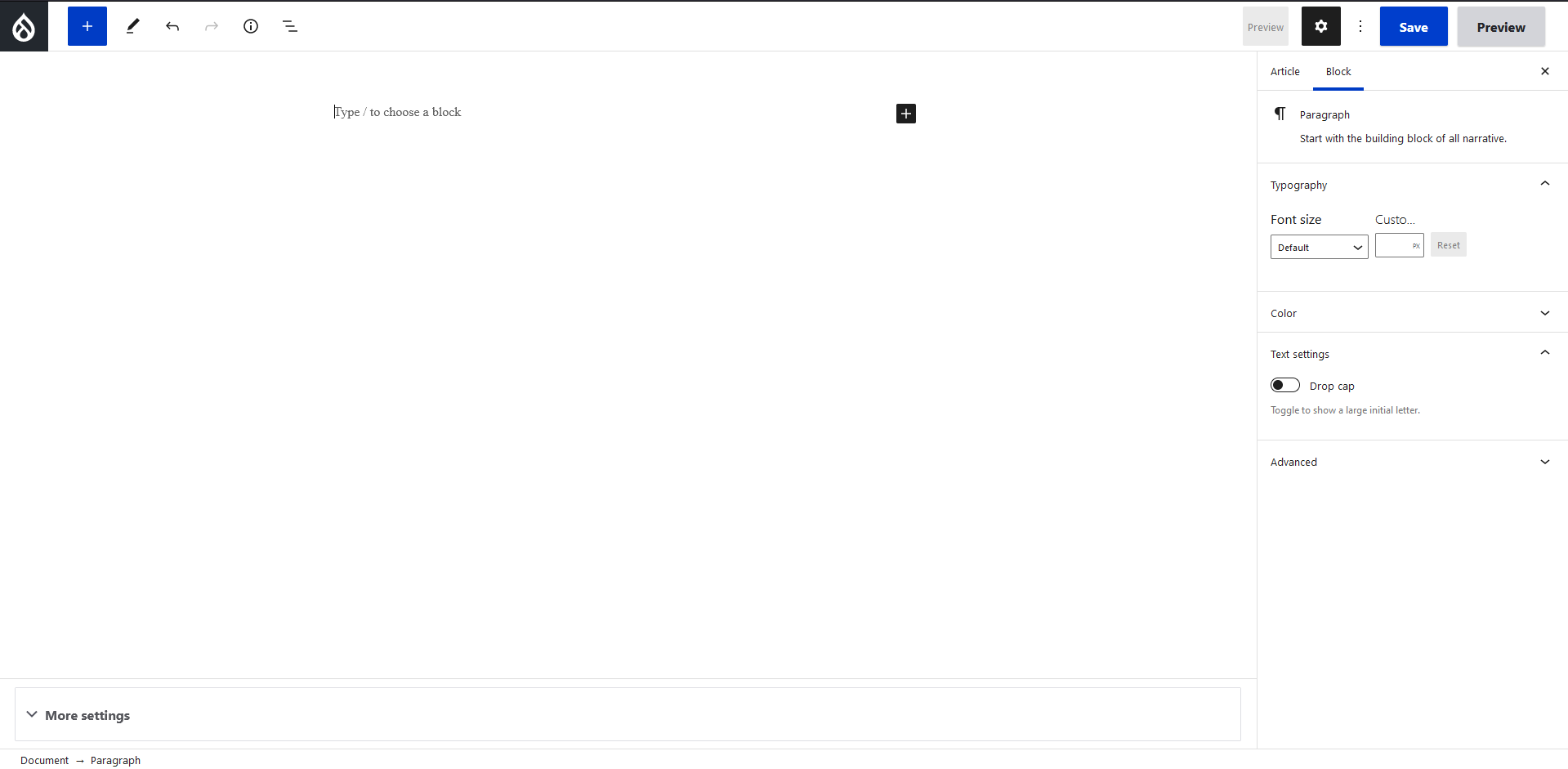
On the right side of the editor, you will see a column that contains more advanced settings for the currently selected block. Each block element has settings that are specific to that particular block which you can use to customize certain attributes. Take for example the paragraph settings:
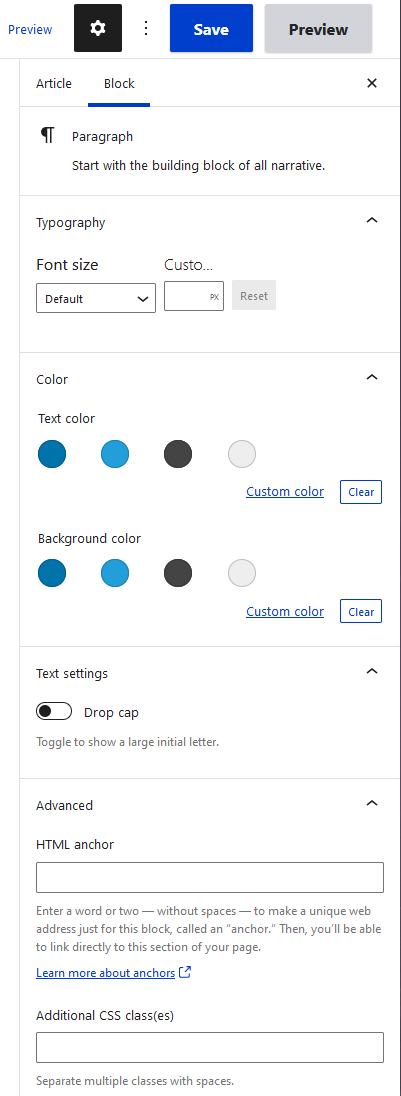
You can see in the above image that there are settings for the font size, text/background color, custom css classes, etc. You can toggle this settings window by clicking the gear icon at the top right corner of the editor.
Grouping
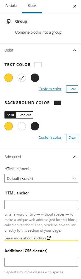
By default, Gutenberg will want you to insert blocks one after the other in a linear fashion. But what if you wanted to associate blocks together in their own group? Say for example you wanted a group of blocks to have a different background or text color from the normal document styles. This is where Group blocks come in; to create a group, simply click the plus icon in your document, and insert a "Group".
You can now insert blocks inside of the group, and use the group settings to control the look and feel of all the blocks inside of it.
The potential of group blocks goes even further - there is no depth limit to groups, so you can nest them inside each other to customize your document to any degree necessary. On its own this is useful, but in future installments we will see how the concept of groups really opens up new possibilities when we start digging in to customizing Gutenberg.
Bootstrap
If you installed the Bootstrap module for Gutenberg, you will see additional block types for Containers, Rows, and Columns. Gutenberg treats these as special type of "Group" blocks in that they can have other blocks nested inside of them, while also providing additional Bootstrap-specific settings. The normal Container -> Row -> Column hierarchy should still be followed when using Bootstrap blocks.
Breadcrumb
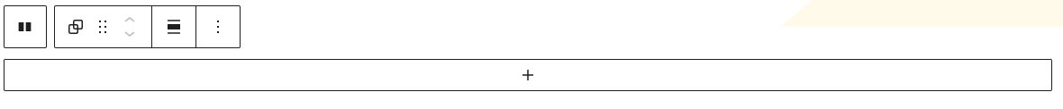
One more useful tool to be aware of is the Breadcrumb at the bottom of the editor. This provides a way of showing you where you currently are in the document hierarchy. You can click on any item in the breadcrumb to select that block which will aid you in navigating the document.

Up next is part 3, where we'll go over some basic methods of customizing Gutenberg to look more like your theme.